
Symbols from antiquity played an important role. Either to indicate belief in a deity or that one belongs to a family, even to a wider whole.
Today the big companies are now known only for their logo. In fact, many invest a lot of money in creating a world-renowned brand.
Although the Rock/Metal world has a different approach to life and nature in general, it does not cease to be acrobatic between religion and a successful business.
After all, the big bands are just that, whether we accept it or not! A successful business!
Success and prestige in some cases are due to a successful logo!
In short, all you need is creativity, imagination, and communication (good marketing).
The Rolling Stones
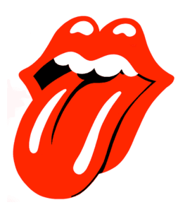
Undoubtedly the British band Hot Lips brand is one of the most recognizable in world music and not only history.
A clever composition between the Hindu goddess Kali (tongue), which symbolizes both the transcendence and the mouth of Mick Jagger.
Many may know a few songs of the band, but they certainly are aware of that tongue.
The Doors
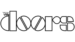
The Doors logo is definitely the joy of the graphic designer!
Although metaphysics and shamanism dominate their lyrics, there is nothing metaphysical in their logo.
A very carefully designed font with the two “o” reflected geometrically, like two pills, reminiscent of the psychedelia of the time.
The article “the” on the top left, discreetly takes us back to the ’60s, with a font that was widely used at the time.
The Monkees

Perhaps one of the smartest logos is that of an American TV pop-rock band.
With the help of television at the time, they were able to capture the psychedelic atmosphere of the 1960s.
With the letters of their name, they form a guitar, the keys of which are in the shape of a heart.
They are essentially the forerunner of the peace and love movement that would culminate a few years later.
AC/DC
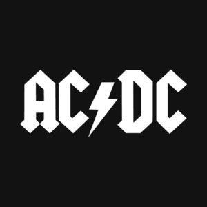
A logo behind a sewing machine managed to conquer the whole world!
At the same time, the band became one of the most profitable companies in the music industry.
The DC/AC symbol with the lightning bolt replaces the dash and the sharp corners in the font show exactly what the band has been offering us for decades…
Clear electricity!
Bon Jovi
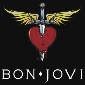
Perhaps one of the most emblematic themes of music is the Bon Jovi logo.
A knife nailed to a heart with wings shows even the most popular object of the lyrics even in Rock…
A wounded heart.
Some gothic touches make their logo even more romantic.
Red Hot Chili Peppers
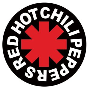
It was officially designed by the band’s singer Anthony Kiedis in 1984 for their debut album.
But it’s the “Symbol of Chaos“, a painting created by Michael Moorcock.
The musician and fantasy writer created it in the early ’60s for the needs of his work “Elric of Melniboné”.
“Star of Affinity”, as it became known in pop culture, was also captured by Kurt Vonnegut in 1973 for the novel entitled “Breakfast of Champions”.
The frontman of the popular band himself explains in the autobiography of “Scar Tissue“, that it is “an angel in heaven’s asshole”.


